~$ retrospectives: that time i helped track Geneva's pollution
Posted on Jul. 30th, 2026. | Est. reading time: 10 minutes
Tags: ProfessionalDevelopmentAcademiaRetrospectives
in this first iteration of the Retrospectives, i wanted to discuss something i did ages ago and still find cool that i was involved in, but never got around to posting on this blog, either because it happened before this blog existed, or because i didn’t have time to post about it then.
Outline
- the backstory
- what were we working with?
- how does academia fit in, and how i worked with that constraint
- prototyping!
- ui testing
- system conception
- mobile app
- deployment
- useability
- personal thoughts
the backstory
so, how did i end up involved in a project to track Geneva’s pollution?
back in 2019, as i had just finished with the spring semester of my first year in the BSc of Information Systems and Services Science at the University of Geneva’s “Centre Universitaire d’Informatique” (Institute of Information Service Science), i was spending some of my summer holidays in the FacLab (my faculty’s makerspace, and what is commonly known as a “third place”).
the FacLab was this place that took over my faculty building’s old cafeteria in the year preceeding, and where i very quickly got involved and started volunteering. it would also informally become my office for a few years, and i would have a permanent desk there until my departure in early 2023.
there, i would meet Emmanuel, who was doing his PhD at the same faculty, and we ended up exchanging a bit and he ended up nerding out about IoT devices and his homebrew project, and that he was workshopping it at sustainability hackathons across Geneva (such as the ones by the United Nations on Sustainable Development Goals).
one thing my faculty offered as an option was to do an “internship” and have that count for academic credits, and this was contingent on writing an internship report… so Emmanuel and myself asked our faculty if i could do an internship at this small non-profit called ACME LogAir that was founded by him and another PhD student, in order to get me some credits for helping them out, and in order for them to get access to a software engineering resource.
the project was basically an attempts at crowdsourcing pollution data, and raising awareness of city pollution to possibly influence local policy decisions, as well as helping people navigate a city whilst avoiding the larger pollution corridors.
the objective was to make a “more-than-a-PoC” type system that would be able to demonstrate at a slightly larger scale what his project was all about, in order to be able to present the concept to the state of Geneva and possibly get state funding.
most of this post contains images and data pulled from my internship report, which ended up being an 84 page pdf that got me a grade of 6.00/6.00, which was quite solid as it was also worth 12 ETCS credits.
what were we working with?
so the original prototype was a small STM32 board that was wired to about 7 other things in a mess of tiny wires:
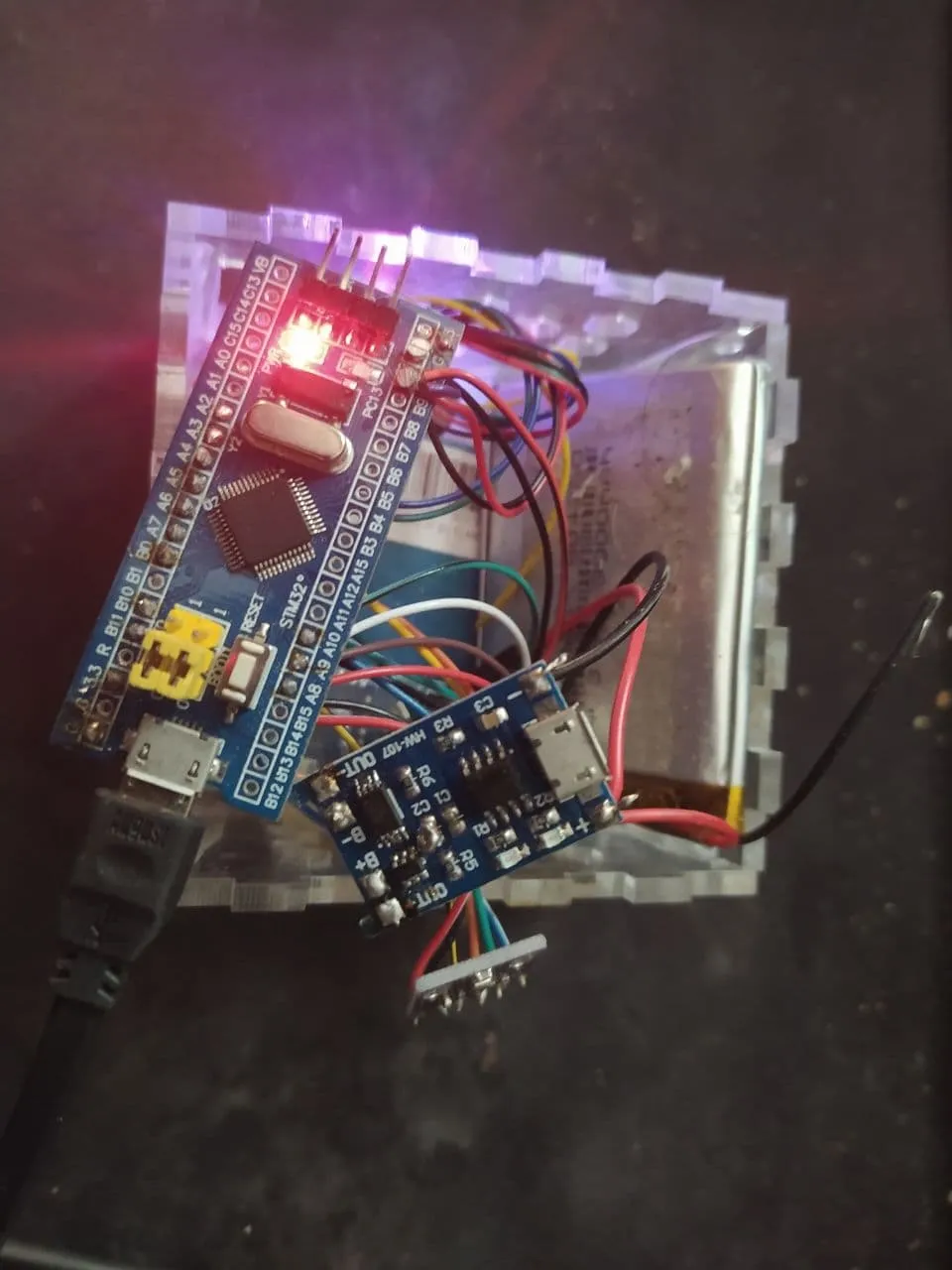
this little thing had the following components:
- it had a battery
- it had a particulate matter (PM) sensor of 4 different granularities (PM1, PM2.5, PM5 and PM10)
- it had a GPS
- it had a temperature sensor
- it had a humidity sensor
- it had a pressure sensor
- it had an SD card
- and the STM32 which had BLE support
the BLE component had a simple wire contract with two data types:
- a header (bytestring) containing the device name, the various sensor serial numbers, sent at contract being and once every so often to prevent drift.
- a packet (bytestring) with the following data items:
- device ID
- packet timestamp
- device position (latitude, longitude, altitude, speed, heading)
- environmental values (temperature, pressure, relative humidity)
- PM values (PM1, PM2.5, PM5 and PM10)
one of the drivers behind this project was Open Science, which meant that collecting the data was good, but being able to share the data was better.
how does academia fit in, and how i worked with that constraint
i mentioned this also was for academic credits, which meant i had to spend some time formalising the process beforehand rather than formalising it as i was approaching relevant milestones.
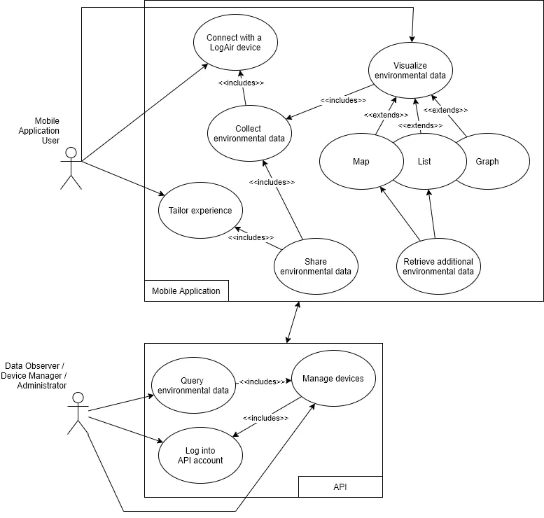
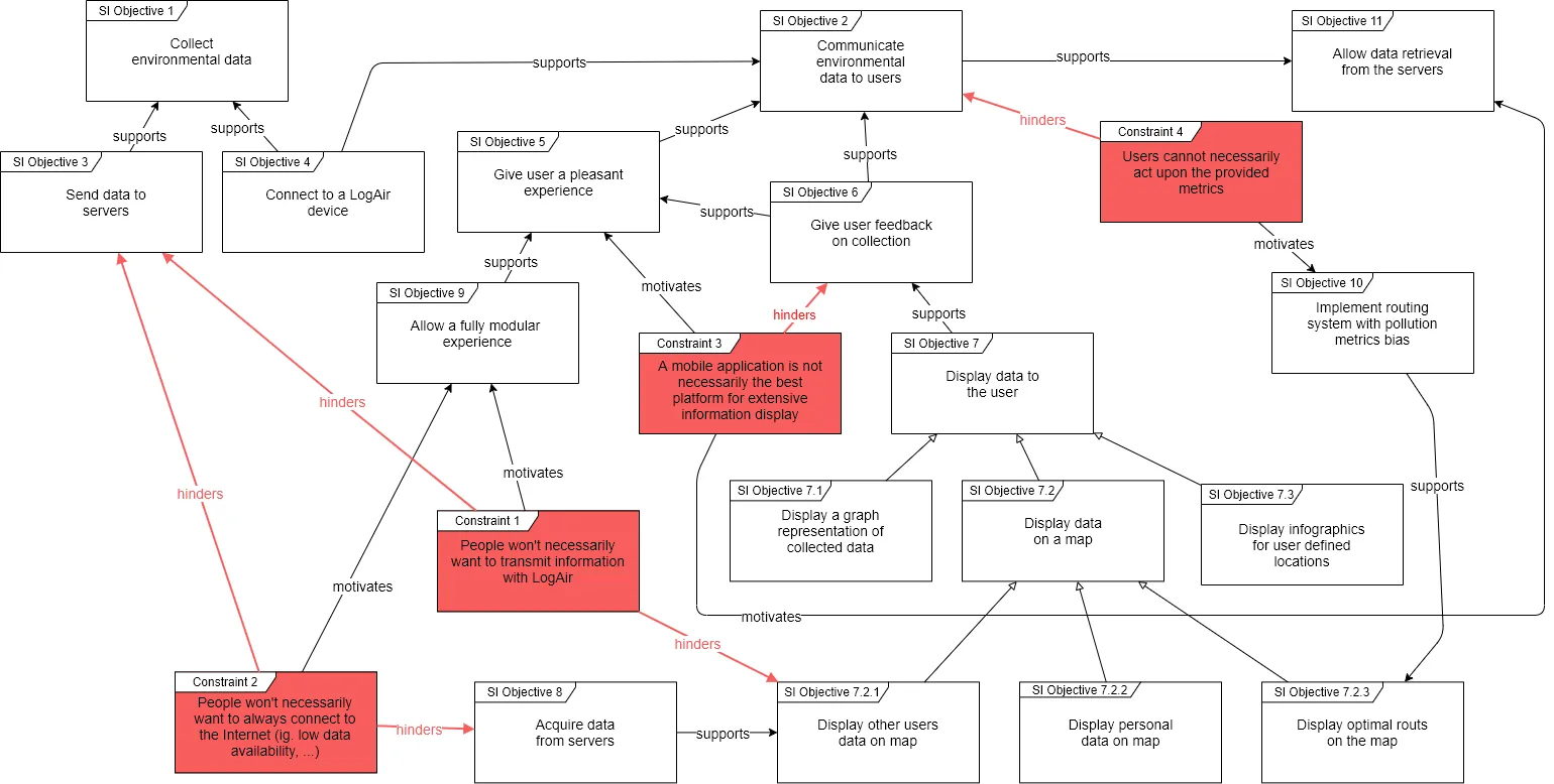
in university we’d spent some time learning about functional and non-functional requirements, user-stories, use cases and information systems objectives, which were processes i applied to this project.
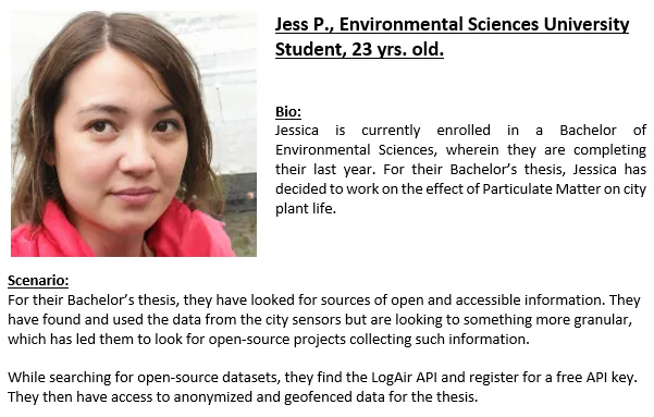
so of course we had user stories, …
expand to view image
… a use case analysis, …
expand to view image
… an information systems objectives analysis, …
expand to view image
… and a functional / non-functional requirements analysis.
expand to view image
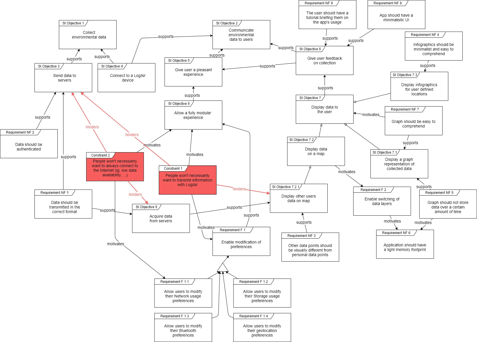
(please excuse how jank and unpolished these diagrams and supporting documents are, they were made in 2020)
these were very useful to at least make sure Emmanuel and myself were on the same wavelength (which we were).
prototyping!
so we had a concept of what it should do, but we had no idea what it should actually look like.
the main requirements from before that were brought up were that it should enable users to view the data they collect and, where possible, view data collected by other users (on some form of map).
there were obviously other technical requirements, such as handling the identification of devices, connection and streaming of data (and when connection was lost, backfilling from the data on the device’s sd card).
this led to some amounts of prototyping, and (once more because academia), i decided to make several prototypes, as i wanted to work with a tryptica-esque design, with 3 main panes with specific functions (social, data, map) and an above settings pane (as schematized below).
expand to view ASCII art that was in the report
+---------------+ | | | | | | | Secondary | +-------------> | | <-------------+ | | Components | | | | | | | | | | | | | | | +---------------+ | | ^ | | | | v v v+---------------+ +---------------+ +---------------+| | | | | || | | | | || | | | | || | | | | || Map | <---> | Data | <---> | Social || | | | | || | | | | || | | | | || | | | | |+---------------+ +---------------+ +---------------+ ^ ^ | | +-----------------------------------------------+so this brought me to the first digital prototype, which i made using draw.io.
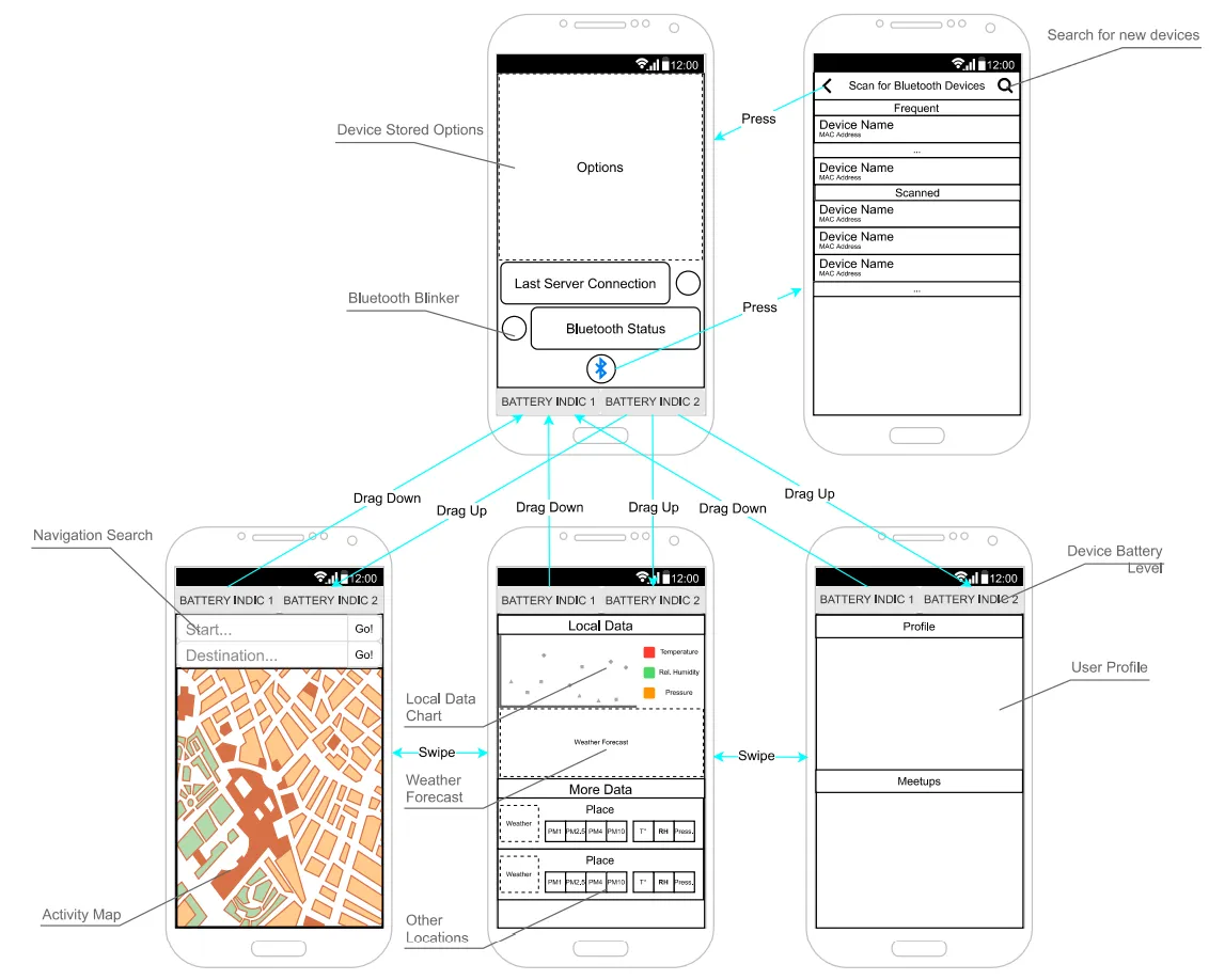
and because i was bored (this was during the onset of COVID, where we were ordered to isolate), i even made a mostly functional paper prototype.
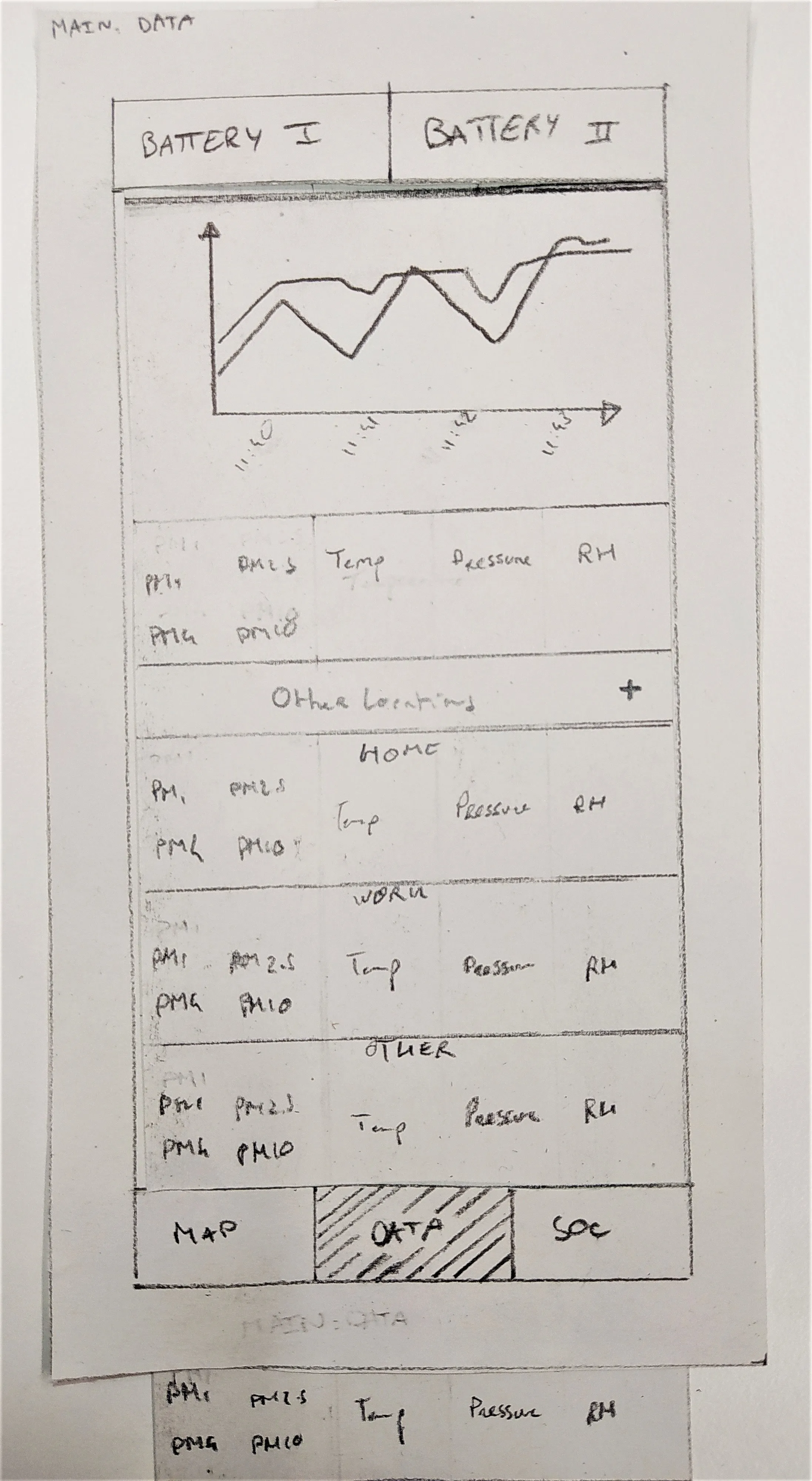
expand to see more pictures of the paper prototype
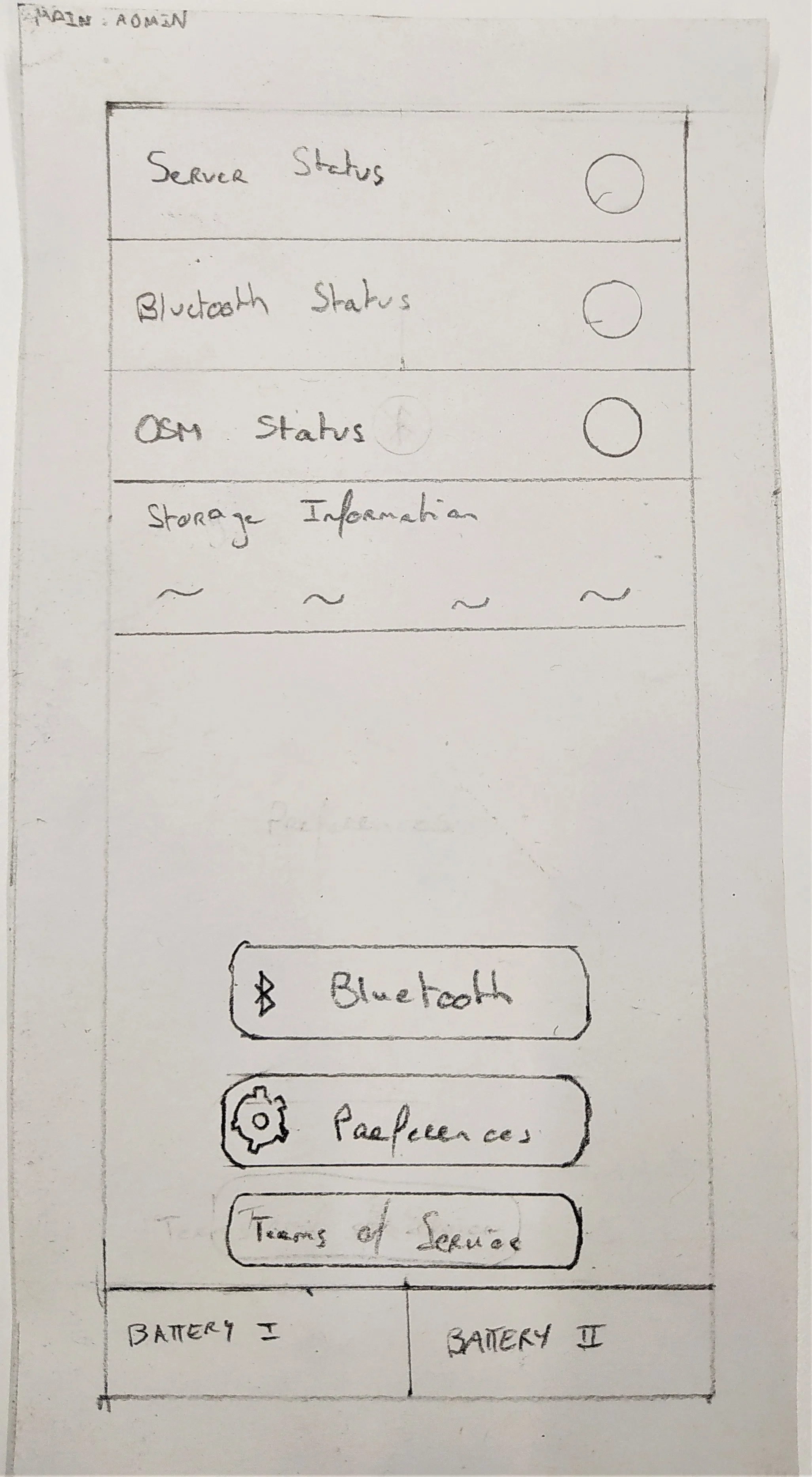
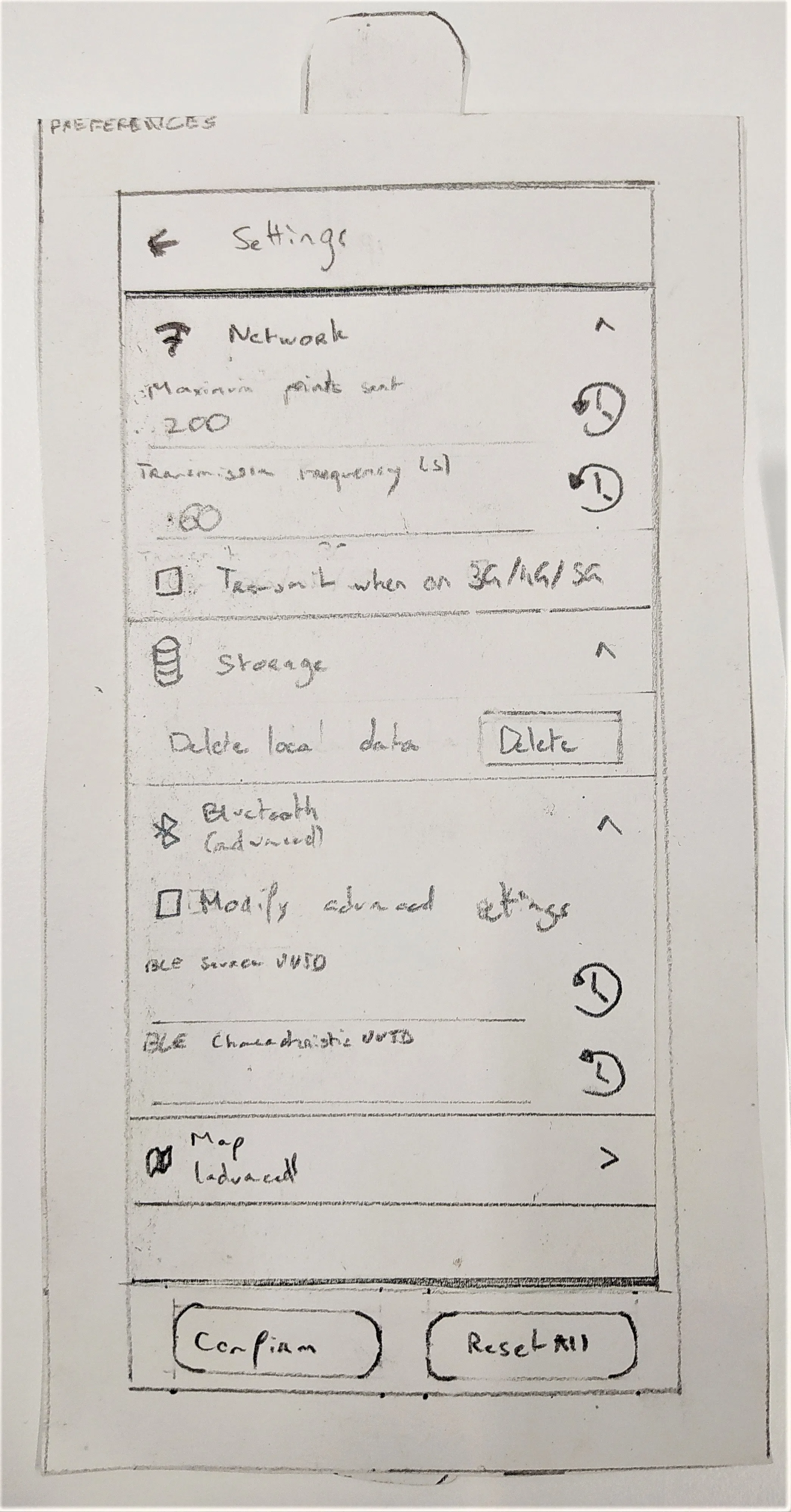
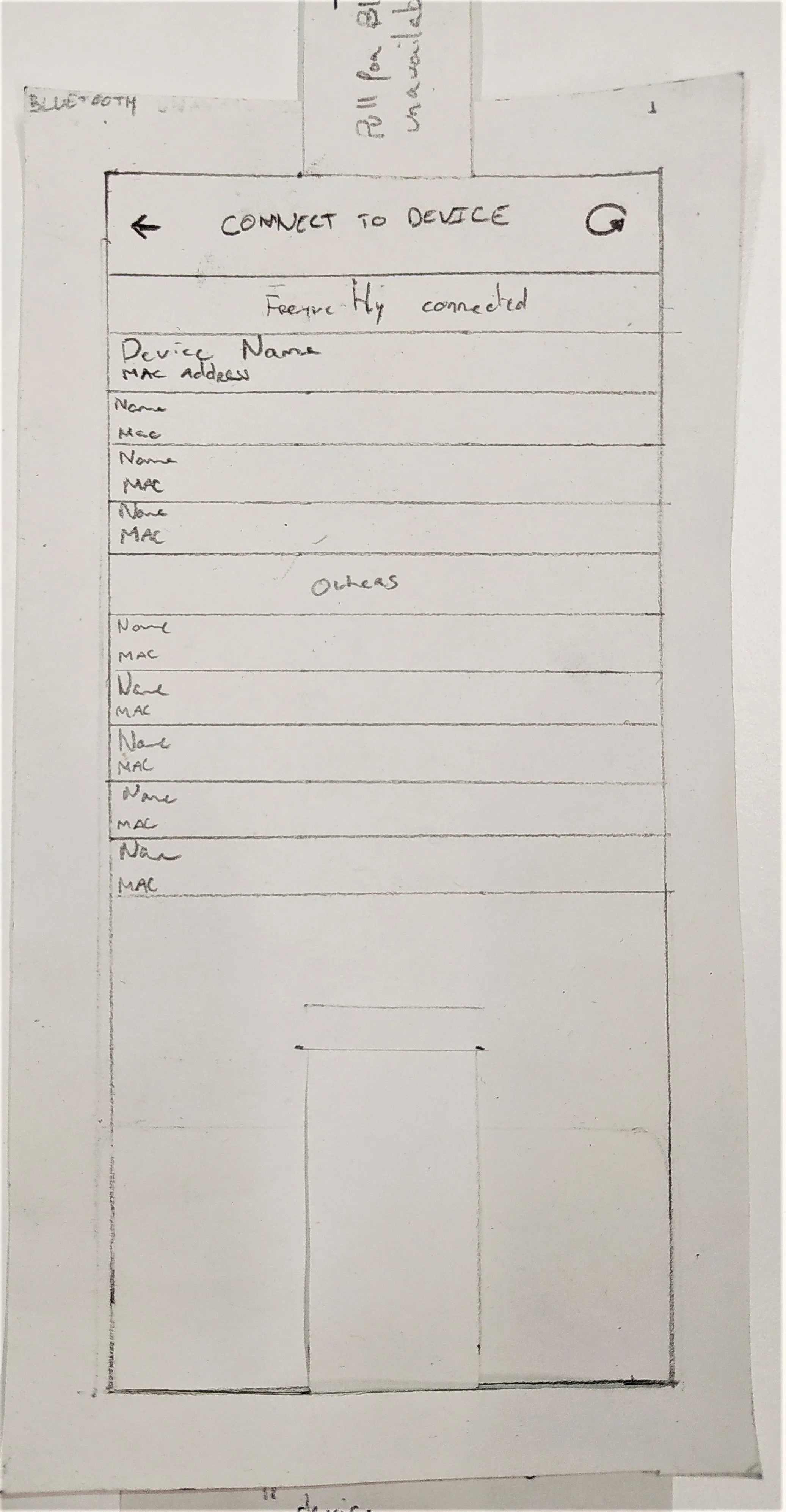
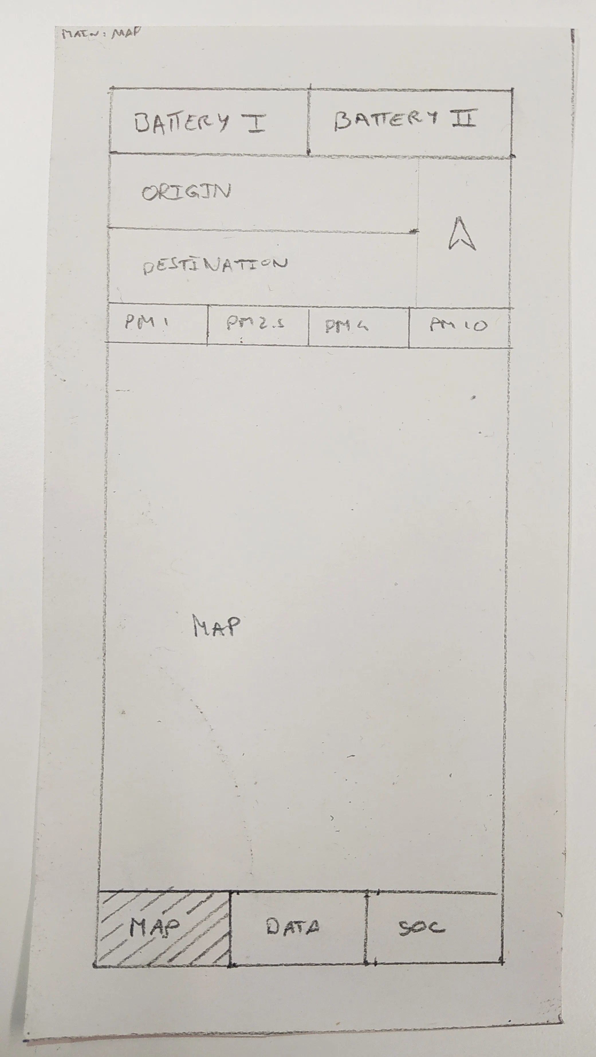
shortly after this i moved on to a second digital prototype, which ended up looking a bit like this:
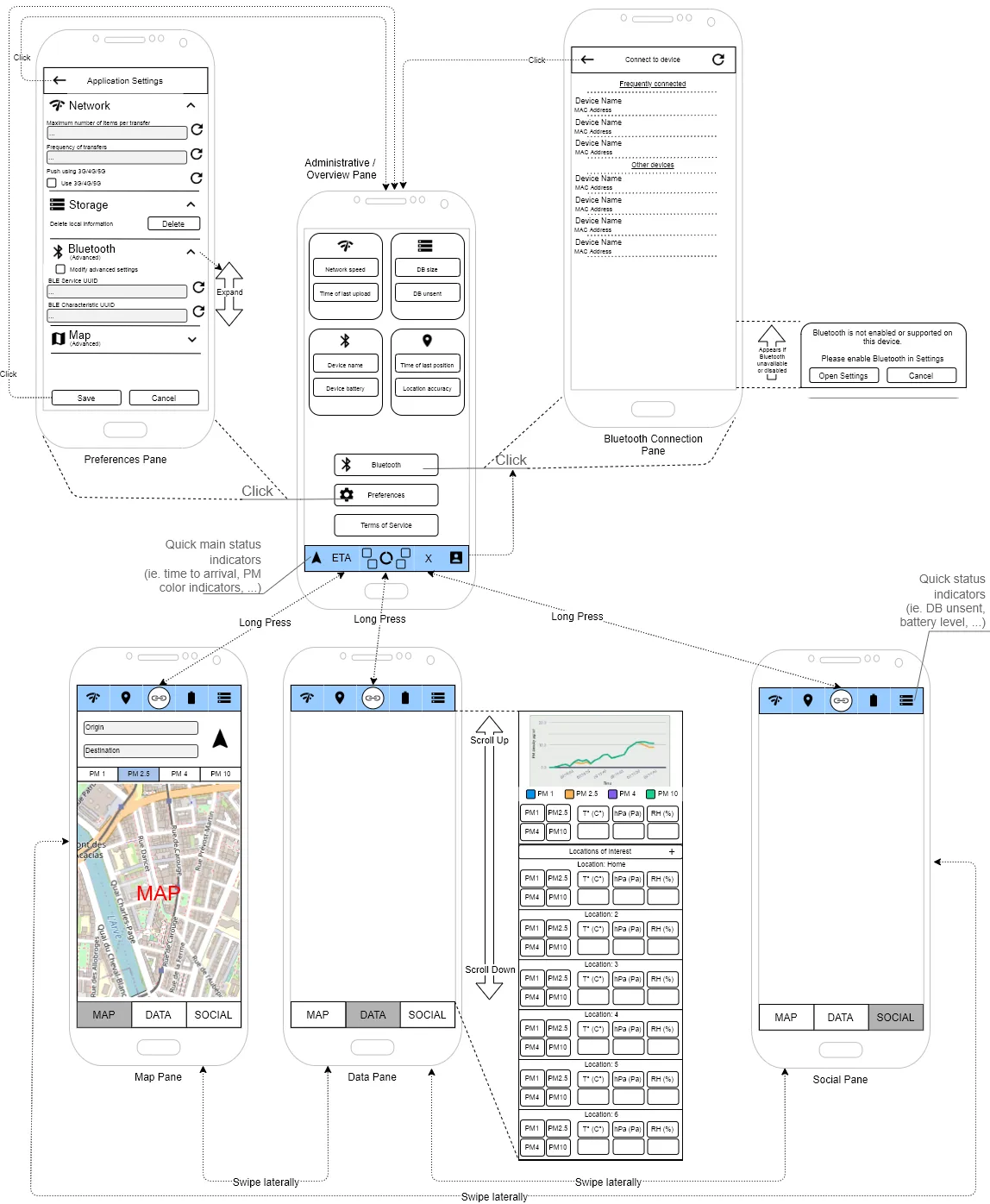
ui testing
i then ran a UI testing protocol, which involved re-creating the UI in an online UI mock tool (in this case it was AxureRP, a platform that enables building some base interactability and sharing the prototype with a password), and because it was at the height of COVID, i had to run the tests remotely via Zoom.
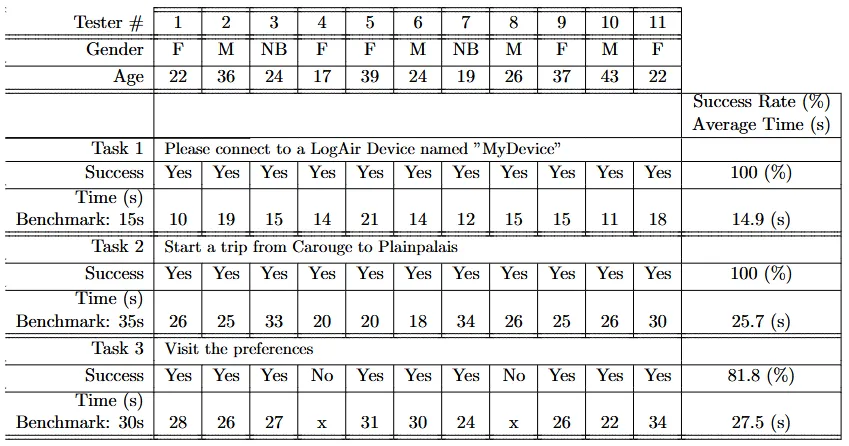
11 people were involved in the test, which had a list of tasks:
- connect to a device
- start a trip from point A to point B
- visit the preferences menu
this was relatively successful, as the table below summarizes:
system conception
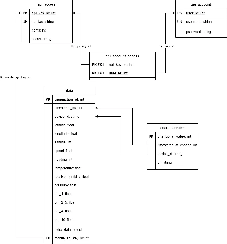
the database evolved through 3 iterations, going from a raw dump of data into the database, to a database schema that had change tracking, to a schema that included an attempt at ensuring that the data could only be accessed in its entirety by the people having uploaded it themselves.
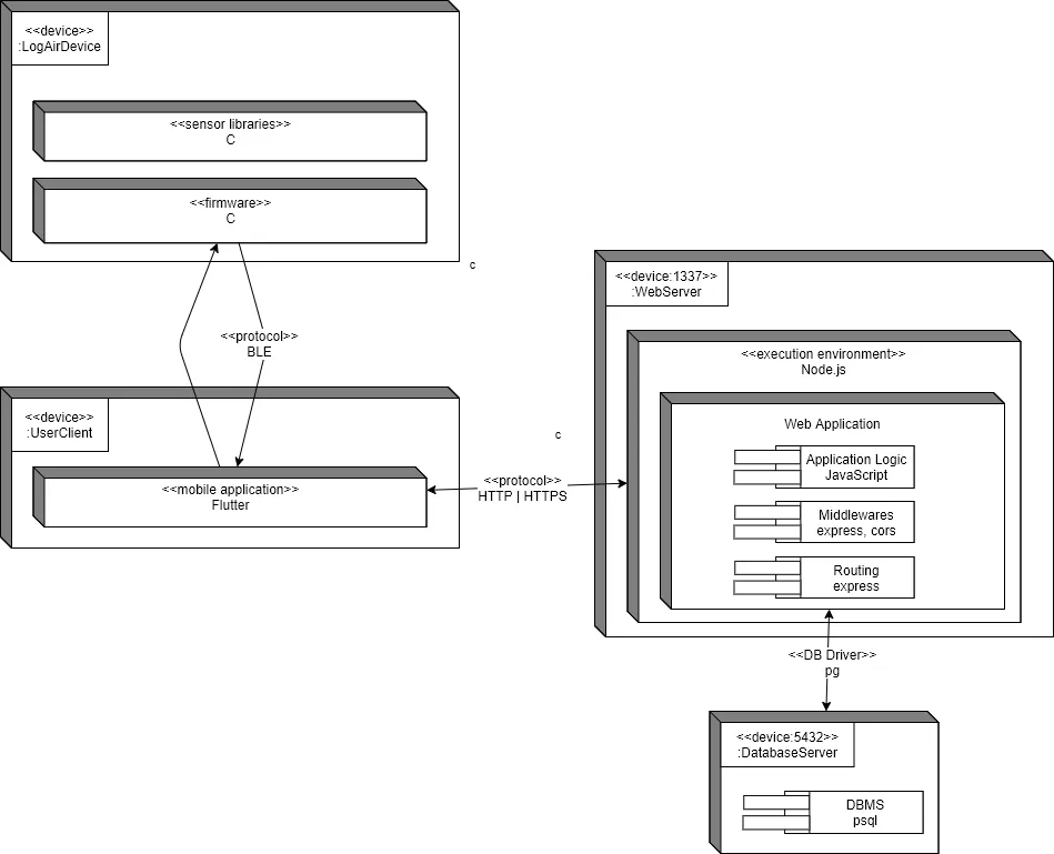
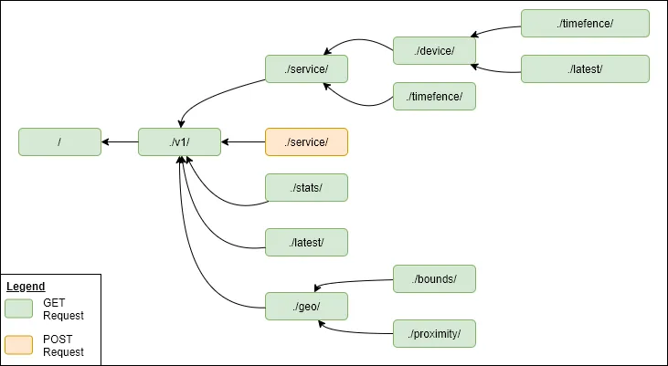
once i had a db schema, i needed to figure out how the data would in fact be communicated between the API, the database, and the various users, which led to the following schema.
this of course had no knowledge of the concept of scalability, and therefore completely ignored it.
mobile app
once we’d gotten the easy parts out of the way, i was left with the implementation of the mobile app.
a proof of concept written by Emmanuel already existed, but this was a very minimal Android-only Java app written in Android Studio.
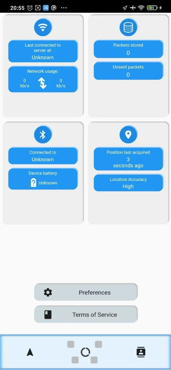
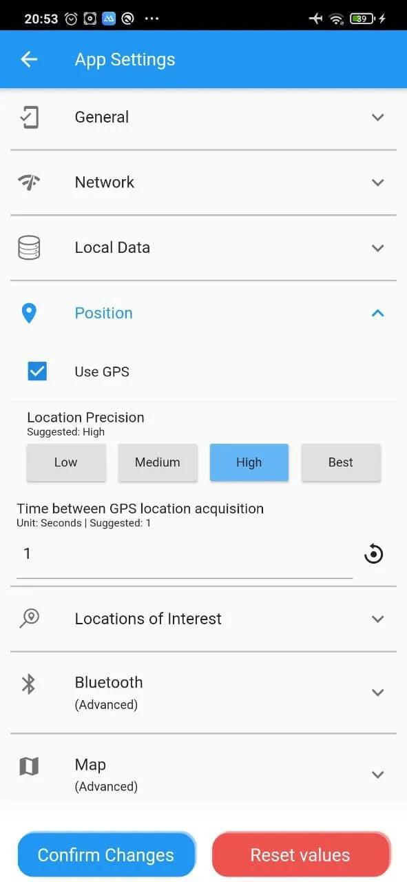
because we wanted ease of deployment and the ability to actually write a cross-platform application in one go, i analyzed the various frameworks for mobile apps that were available at the time (including frameworks like Ionic or Xamarin), and came to the conclusion that Dart, as well as the UI stack Flutter would be the best option for this project.
the implementation strategy was to first validate the framework on a technical basis, such as whether it could process BLE data, whether it could ask for permissions or whether it could display graphs, before making the app look nicer.
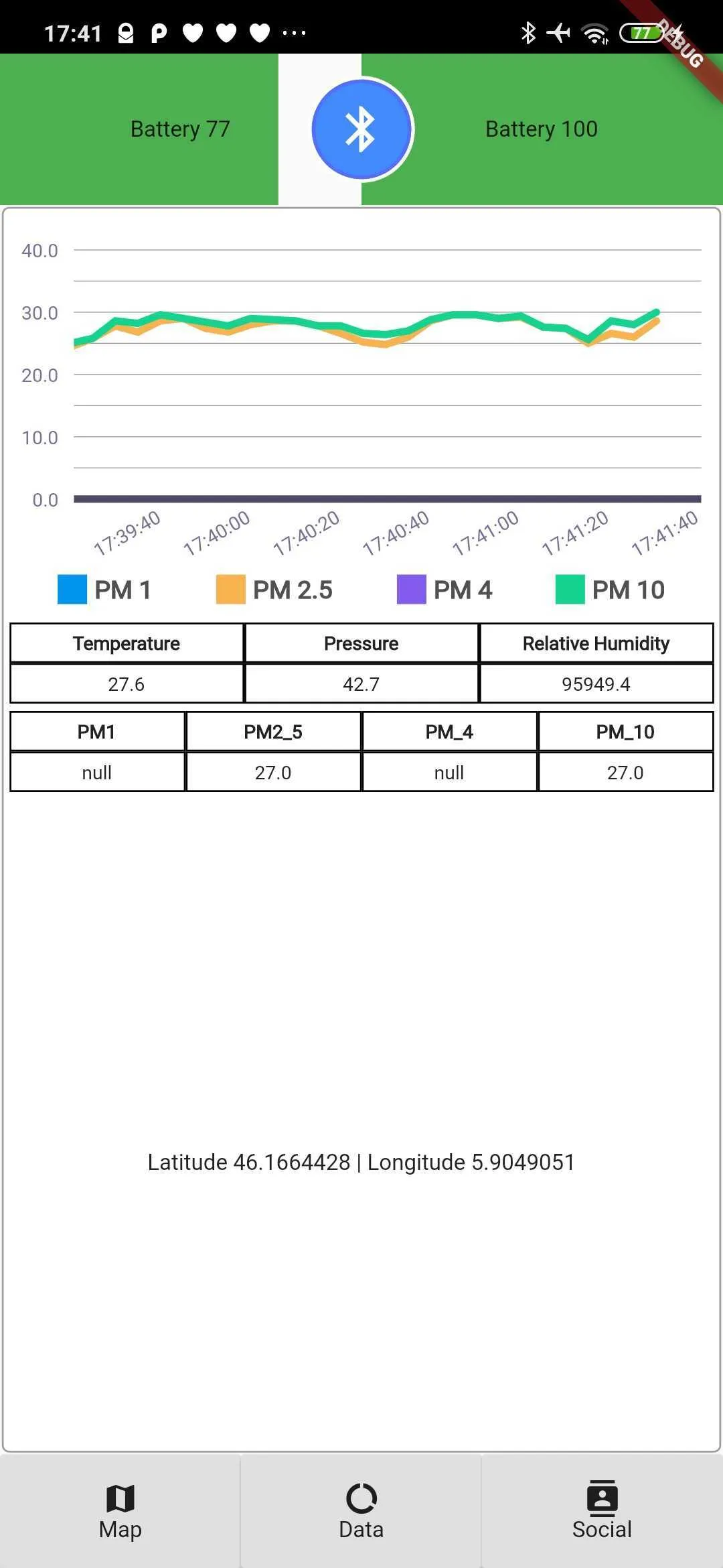
expand to see more screenshots of the app
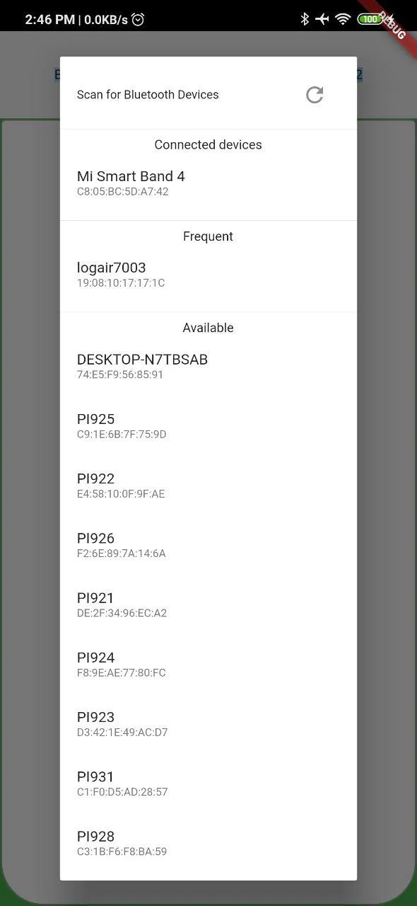
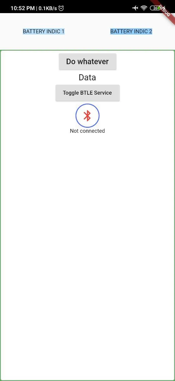
anyways, this all looks supremely jank, and therefore i decided to change some of the layouts to attempt (and probably fail) to follow neumorphic design rules
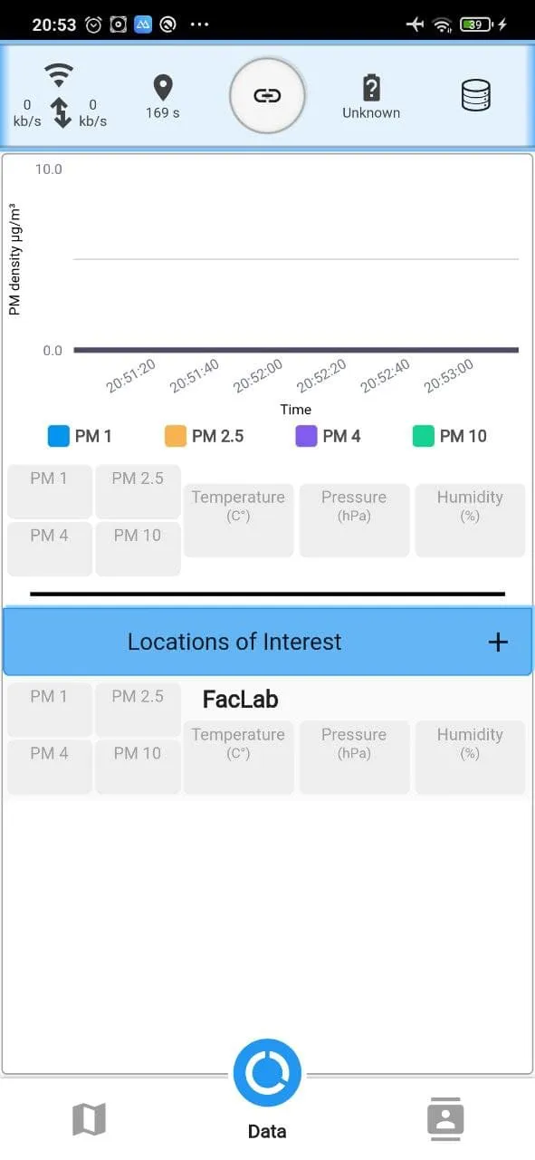
expand to see more screenshots of the app
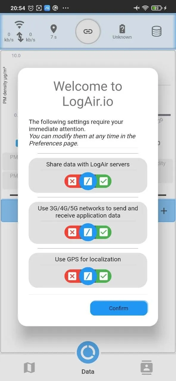
deployment
the backend was a node.js express instance and a postgres instance, all of which ended up being deployed on a small server at my university, with 0 regard for containerization or other portability technologies (i think i made a docker image for the API though).
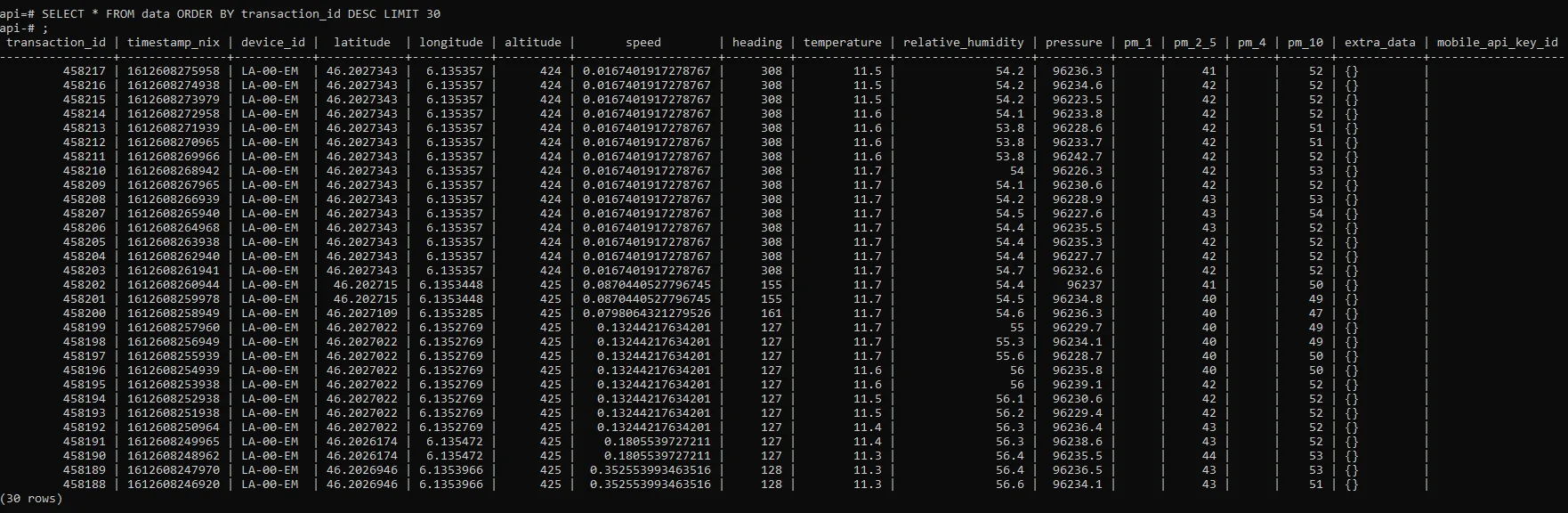
although not perfect it worked seamlessly for about 25 concurrent users and had been stress tested for about 100 with no issues.
useability
because this was a “serious” project - and because it was a core part of the courses at uni - i took the time to run useability tests.
the test comprised of 10 questions and was a follow up with the previous interactive prototype testers.
the questions were the following:
- I think I will use this application regularly.
- I find that this application is too complex for no reason.
- I find that this application is easy to use.
- I believe I would need the help of a specialist to be able to use this application.
- I find that the various functionalities of this application have been well integrated.
- I find that this application is too incoherent.
- I believe that a majority of people would be able to learn how to use this service quite rapidly.
- I found this application quite cumbersome to use.
- I felt quite confident whilst using this application.
- I believe I need to learn more things before being able to use this application.
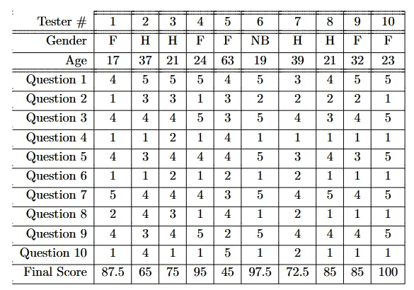
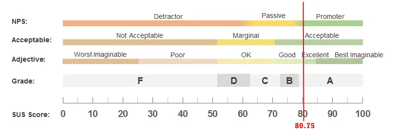
these weren’t perfect scores but definitely were in the “useable” category, with some additional work to be done as highlighted by the respondents, which got baked into the project later on.
personal thoughts
i’m kind of 50/50 on this project, because although i did produce something that answered the needs of the project and that was actually used to demonstrate that Geneva has a pollution issue, this was very much in the early days of my career, and it kinda shows.
nowadays i would put a much stronger emphasis on scalability and security, and maybe put more effort into making the features such as “displaying pollution data on the map” better at aggregation metrics, which at a scale of 50-200 users across a city is more of an issue than when one has thousands of users.
in retrospect (“roll credits!”), i did enjoy this project and it did bring me some first contact with managing users, managing expectations, and managing requirements, and those were pretty formative. this project did however solidify my take that i am very much not a fan of mobile app development, and that i consider that to be one of my personal hells (as compared to backend / api development, which is significantly less “organic” in how one builds the system).
it’s been a long time since i’ve worked or even looked at this project, but as far as i can see, it slowly got dropped as the various involved parties went on in life, with me having to do my bachelor’s thesis and starting my master’s afterwards, with Emmanuel having to focus on his PhD and with the other person involved finishing her PhD and moving back to Brazil. this is simply the way of things
in the meantime, Geneva’s public transport authority has had a few flagship projects deploying pollution sensors at their bus stops and on some of their busses, which has also helped shape some of the local politics.


